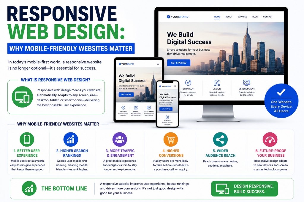
Mobile devices account for over half of all web traffic worldwide. Because of this, search engines prioritize mobile usability. Responsive web design ensures that your website automatically scales its layout, images, and content to fit any device viewport.
This article discusses the importance of responsive layouts for mobile SEO, usability, and digital conversions.
Table of Contents
1. Google's Mobile-First Indexing
Google indexes and ranks websites based on their mobile versions. If your site has a great desktop design but is broken or slow on mobile, your search rankings will drop across all devices. A responsive design is essential for maintaining visibility.
2. Improved Website Usability (UX)
A responsive design prevents users from having to pinch, zoom, or scroll horizontally to read text or interact with forms. Usability directly impacts search rankings, as search algorithms measure user engagement and bounces.
3. Cost-Effective Maintenance
Creating a single responsive website is far more cost-effective than building and maintaining separate desktop and mobile sites. It ensures updates, content additions, and SEO optimizations apply across all devices simultaneously.
| Device Type | Average User Share | Usability Requirement |
|---|---|---|
| Mobile Phones | 58% to 62% | Touch target sizes, small headers, collapsed menu drawers |
| Tablets | 3% to 5% | Flexible grids, multi-column scaling, medium margins |
| Desktop / Laptops | 35% to 38% | Hover states, wide layouts, interactive elements |
"Design is not just what it looks like; it's how it works. A mobile-friendly website is no longer a feature—it is a baseline business requirement."
4. Higher Conversion and Lead Capture Rates
If a mobile user lands on a site that is easy to navigate, they are much more likely to complete a form, call your office, or make a purchase. Responsive web design aligns layouts and buttons to maximize mobile conversion rates.
5. Eliminate Duplicate Content Risks
Running separate desktop (e.g. `yourdomain.com`) and mobile (`m.yourdomain.com`) sites can create duplicate content issues. A single responsive URL ensures that search signals, backlink equity, and traffic logs consolidate on a single domain.
Key Takeaway
Open your site on a tablet or phone. Make sure buttons are at least 48x48 pixels in size to prevent accidental clicks. Mobile usability matters!
By focusing on these core elements, Balamurugan P. helps brands scale their monthly traffic and achieve sustainable growth. Let's start optimizing your online visibility today.
Frequently Asked Questions
A design approach where website layouts automatically adapt to render beautifully on all device screen sizes, from mobile phones to large desktops.
Google crawls and ranks websites based on their mobile version rather than the desktop version, making responsive design mandatory for SEO.
You can use browser Developer Tools (F12) to simulate different device dimensions or test page behaviors directly on actual mobile devices. For more information, visit the official W3C Standards guidelines and MDN Web Docs. For more information, visit the official W3C Standards guidelines and MDN Web Docs.